Pickleball Court Colors: Visibility, Contrast & Surface Design
Pickleball court color is not just an aesthetic decision. The surface behind the ball affects how quickly players can pick it up visually, the lines need to remain easy to distinguish, and a multi-color design can either clarify the court or make it harder to read.
The useful question is therefore not “What is the best-looking pickleball court color?” It is “Which color system gives the ball, lines and playing zones enough contrast for the people who will actually use the court?”
The short answer
There is no single required playing-surface color for a standard pickleball court. USA Pickleball advises that surface color can affect ball visibility and recommends creating strong contrast between the ball and the surface. Its court guidance specifically suggests choosing a ball color opposite the surface color on a color wheel for maximum contrast.
For permanent courts, 100% acrylic coatings are commonly recommended for hard-court surfacing. The color choice should be made together with line color, expected ball colors, lighting and surrounding backgrounds rather than in isolation.
Think in three visual layers
A good court color plan separates three things:
- The ball, which players must track at speed.
- The court lines, which players and officials must judge accurately.
- The playing surface and surrounding area, which form the visual background.
These layers have different jobs. A dramatic color combination can look excellent in a rendering but perform poorly if a common ball disappears against it or the lines visually merge into adjacent areas.
Ball contrast matters more than copying a fashionable court
Ball visibility changes with the relationship between ball color and background. A bright yellow-green ball can stand out strongly against some blues, for example, while a similarly colored surface may reduce separation.
That does not mean every court should be blue. Facilities use many successful color schemes. The better approach is to identify the balls most likely to be used, then test those balls against candidate surfaces under the actual lighting conditions.
For a private court where one owner controls the ball choice, this is relatively simple. At a club or public facility, players may arrive with several ball colors, so a surface that offers broadly useful contrast can be more practical than optimizing for one exact ball.
Line visibility is a separate problem
Even when the ball is easy to see, poor line contrast can make close calls unnecessarily difficult. Pickleball lines should be visually distinct from the playing surface.
This becomes especially important on shared-use courts. Adding pickleball lines to an existing tennis or basketball surface can create several overlapping colors, and too many similarly prominent markings make the playing geometry harder to parse.
If you are converting an existing space, do not choose the new pickleball line color from a small paint swatch alone. Lay out sample strips at full line width and view them from typical serving, Kitchen and sideline positions.
Should the Kitchen be a different color?
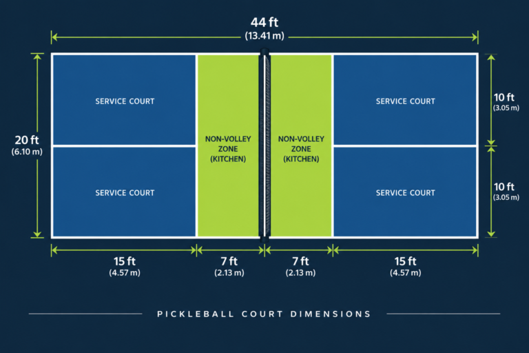
It can be. A contrasting non-volley zone can make the Kitchen visually obvious, which some recreational facilities prefer. But a separate Kitchen color is not necessary for players to understand the court, and more colors do not automatically improve visibility.
A two-tone court works best when the zones remain visually coherent and the lines are still unmistakable. If the Kitchen, service courts, perimeter and lines all compete for attention, the design has become decorative at the expense of readability.
Playing area vs surrounding area
Using one color inside the court and another around it can help players perceive the court boundary quickly. This is also a useful way to create visual identity without making the actual playing area overly complex.
For a multi-court facility, consistency usually helps. Repeating the same surface and line hierarchy across courts reduces visual adjustment as players move between them.
Outdoor courts need a real-world color test
Outdoor color appearance changes with direct sun, cloud cover, shadows and time of day. A sample that looks muted indoors may appear much brighter outside. Surface glare and surrounding scenery can also affect ball tracking.
Before committing to a large installation, compare coating samples outside and place real pickleballs over them. Look from several court positions rather than only straight down at the sample. If the facility will have evening play, repeat the test under the intended court lighting.
Indoor courts have different backgrounds
Indoors, the floor is only part of what a player sees. On higher balls, the background may become a wall, curtain, bleacher section, ceiling or bright doorway.
That means an indoor facility can have excellent floor contrast and still have tracking problems. When evaluating an indoor color scheme, stand on court and look through the trajectories players actually use: dinks, drives, lobs and overheads.
Background clutter and lighting deserve attention alongside the surface itself.
Why acrylic coating is common on hard courts
USA Pickleball’s construction guidance recommends 100% acrylic coatings for athletic hard courts. A properly specified sports coating does more than add color: its aggregate and application affect texture, traction and ball response.
Color therefore should not be treated as ordinary decorative paint. If you are resurfacing a dedicated court, use a system intended for athletic surfaces and follow the manufacturer’s preparation and application requirements.
For more on how the underlying system changes play, see the guide to pickleball court surfaces.
A practical color-selection process
- Choose the balls you expect to use. Include more than one color if the court is public or club-operated.
- Shortlist surface colors. Start with ball visibility rather than branding.
- Select a clearly contrasting line color. Test it against every adjacent playing color.
- Decide whether zones need separate colors. Add a second playing color only when it improves function or serves a clear design purpose.
- Test samples in place. Check sun, shade and artificial lighting where applicable.
- View the samples from playing distance. A small chip in your hand does not reproduce on-court perception.
- Check the whole background. Walls, fencing, windscreens and neighboring courts can enter a player’s visual field.
- Confirm the coating specification. Color cannot compensate for the wrong surface system or poor installation.
Common mistakes
Choosing only from a rendering
Digital mockups are useful for layout but unreliable for judging real surface appearance. Screens, sunlight and coating texture all change perceived color.
Matching the court to the ball
A coordinated color palette may look polished but can reduce ball visibility. The ball is supposed to separate from the background, not blend into it.
Adding too many line systems
Shared courts can become visually noisy. If multiple sports must coexist, establish a deliberate hierarchy of line colors rather than giving every marking equal prominence.
Ignoring evening conditions
A scheme that works at noon may behave differently under LEDs. Test the actual ball, surface and lighting combination whenever possible.
Treating court coating as house paint
A sports surface needs appropriate texture and performance characteristics. Select the coating system first, then choose among its suitable colors.
What about heat?
Dark surfaces exposed to strong sun can become hot, but surface temperature depends on more than the color name: solar exposure, coating formulation, air temperature, wind and substrate all matter. If heat is a major design concern, ask the coating manufacturer or court contractor for product-specific thermal information instead of assuming two colors will behave identically everywhere.
Heat is also only one part of outdoor court planning. court orientation, shade, drainage and lighting can matter just as much to daily usability.
Color cannot fix a bad court layout
Strong contrast helps visibility, but it does not replace correct dimensions, adequate run-off or proper construction. A regulation pickleball court is 20 by 44 feet, while USA Pickleball recommends a larger total playing surface around it. Review the pickleball court dimensions before finalizing a permanent design.
Likewise, color decisions should come after the project has accounted for base construction, drainage and slope, fencing and other physical requirements.
Best decision rule
Choose court colors in this order: ball visibility, line readability, playing-zone clarity, then aesthetics.
That order still leaves enormous freedom to build an attractive court. It simply prevents branding or personal preference from undermining the basic visual task players perform on every rally: seeing the ball early and judging the court accurately.
Bottom line
There is no universal “best” pickleball court color. The best scheme is the one that produces strong contrast between the balls, lines and backgrounds used at that specific facility while working with a proper sports-surface system.
Test real coating samples with real balls under real playing conditions before committing. That small step is more useful than choosing a color because it looked good on another court.

Jonathan Grøn is a pickleball player and racket-sports enthusiast who focuses on practical doubles strategy, rules, skills, and training. He combines regular on-court experience with research from official rules, coaching resources, and other authoritative sources to create clear, useful pickleball guides.